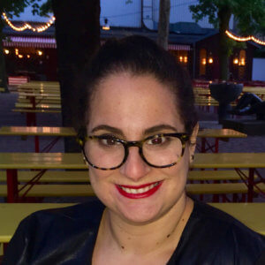
 Molly Lee is the Lead User Experience Designer at Adage Technologies in Chicago. She has been in the user experience field since 2009, and has been working on accessibility for the past 6 years. Today she is most interested in looking at the role accessible patterns and technology play in paving the way for a truly personalized digital experience.
We caught up with Molly to ask her a few questions on accessibility leading up to Accessibility Camp Chicago.
How did you initially get involved with digital accessibility?
I first started learning about digital accessibility in early 2012. At the time I was working at McGraw-Hill on their flagship Higher Ed platform. An outside group had performed an audit and I was in charge with going through and documenting the necessary changes for the platform. As a part of this project I worked on a standardized way for our UX team to include the appropriate documentation on all projects going forward and educating the product development team as a whole on best practices.
Do you feel that interest in accessibility is picking up momentum? How have you seen this?
Definitely. As a designer in a consulting environment, I have seen a huge uptick in clients who are requesting accessibility be included in the process from the get go.
What are the major challenges that you are seeing in making sites and applications accessible?
I have seen a couple of challenges get in the way of accessibility on a larger scale:
- It is always harder to go back and retrofit accessibility rather than planning it from the onset of a project. Many times when clients are coming to us, they are already at the stage where they are worried about or currently facing a legal challenge. With this type of a process, we are more likely to come up with a solution that is less than ideal.
- When creating content management systems, we are relying on the client to input accessible content into their systems. Often we are dealing with tens of thousands of pages of existing content, and it is unrealistic to go backwards through those pages to edit them all. Additionally, content producers need to be educated on standardized best practices. So when a site leaves our hands we try to work with a client to ensure they preserve accessibility.
- Some are still trying to grasp the full implications of accessible design. They view it as a lot of money to spend on catering to a small audience rather than seeing the benefit it brings to all users. Of those who are willing to pay, some are just looking to cover themselves for the time being, rather than being on the cutting edge of accessibility.
What are the examples of success that you have seen in the wild?
Microsoft has some really nice accessible patterns. They seem really committed to being on the forefront of accessibility: https://www.microsoft.com/en-us/accessibility
What is the one thing that excites you the most about your work in accessibility?
There are so many great new resources out there today that didn’t exist 5 years ago. With a larger community of “Accessibility Evangelists” out there, it is exciting to see multiple pathways to accessibility develop in a really creative way.
I also see a really interesting link between accessibility and AI, they share the mutual goals of driving information to be machine readable and allowing users to consume content in the way that works best for them.
If you haven’t already registered for Accessibility Camp Chicago, register today!
